Shapes and Pathfinder
In this edit I used the pathfinder with two different shapes to create a different way the viewer sees the image.
Cartoon Selfie
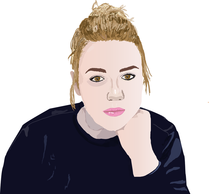
In this illustrator I used a background picture to trace myself. With altering opacity and matching the colour I was able to create a life like image.
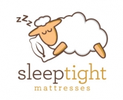
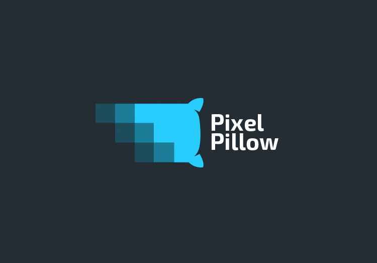
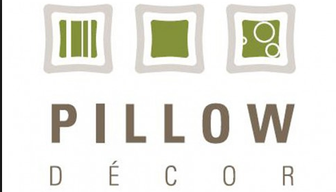
Logo- Dream Serene
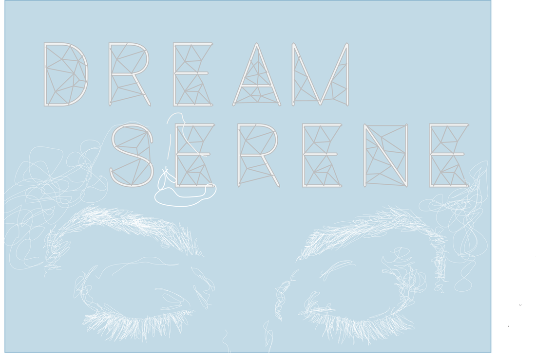
I chose to do my logo from my junior achievement company for pillow cases. I used the soft colours of blue and white to translate the "serene" part of the logo. I though =t it would be a good idea to make the logo look like it was hand-drawn because the pillows are handmade and local, therefore giving a more authentic feel.
PROJECT SUMMARY
We offer uniquely decorated pillows that range from seasonal to watercolour.
We have officially been in business since December 1st 2015,
With out identity I hope to translate the "serene" part of our logo through the soft colours; grey, blue, and white. I also hope to use our modern designs and font to give our buyers a modern and trendy feel.
Our long term goals are to sell a projected amount of pillows before a certain amount of time.
AUDIENCE PROFILE
Our existing audience is from the ages of 10 and up.
I would like to keep my audience the same, because there is a large group of people that it appeals, although it would be helpful to attract more men.
PERCEPTION
I have blue, grey and white to use because they give a calm feel, from soft pastels.
I would like to use closed eyed to shoe sleeping, or a relaxed feel.
COMMUNICATION STRATEGY
My tagline is
The over message I would like to convey is calm, modern and stylish pillow cases.
My logo will be used in many places to represent my JA company.
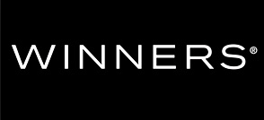
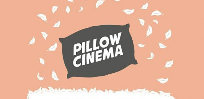
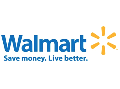
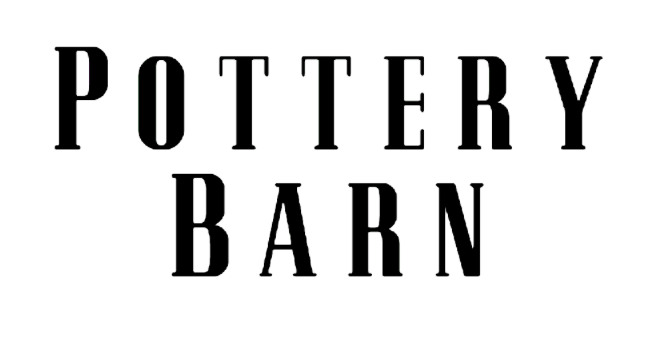
COMPETITORS
My main competitors are winners, pottery barn, and walmart.
Their logos are professional and well known.
My logo is more interesting and has a more creative feel.
TARGETED MESSAGE
"Bring originality to your home."
We offer uniquely decorated pillows that range from seasonal to watercolour.
We have officially been in business since December 1st 2015,
With out identity I hope to translate the "serene" part of our logo through the soft colours; grey, blue, and white. I also hope to use our modern designs and font to give our buyers a modern and trendy feel.
Our long term goals are to sell a projected amount of pillows before a certain amount of time.
AUDIENCE PROFILE
Our existing audience is from the ages of 10 and up.
I would like to keep my audience the same, because there is a large group of people that it appeals, although it would be helpful to attract more men.
PERCEPTION
I have blue, grey and white to use because they give a calm feel, from soft pastels.
I would like to use closed eyed to shoe sleeping, or a relaxed feel.
COMMUNICATION STRATEGY
My tagline is
The over message I would like to convey is calm, modern and stylish pillow cases.
My logo will be used in many places to represent my JA company.
COMPETITORS
My main competitors are winners, pottery barn, and walmart.
Their logos are professional and well known.
My logo is more interesting and has a more creative feel.
TARGETED MESSAGE
"Bring originality to your home."
|
|
|
|
|